The key to successful hybrid exhibits isn’t the flashiness of the technology, but its ability to create cognitive fluency and emotional safety for every visitor.
- Complex interfaces that trigger anxiety or fear of failure are the primary reason non-technical visitors disengage.
- Seamlessly blending digital and physical elements requires treating the entire environment—from cables to attendant interactions—as part of the user experience.
Recommendation: Shift your design focus from “what the tech can do” to “how the visitor feels” to create experiences that are truly inclusive and memorable.
We’ve all seen it: the state-of-the-art interactive display, designed to dazzle and inform, left untouched. A visitor approaches, hesitates, and walks away, perhaps feeling that the technology is “not for them.” As an exhibition designer, this is a quiet failure. You’re trying to bridge the physical and digital worlds, but for many, especially older or less tech-savvy audiences, that bridge feels unstable. The common advice—”make it intuitive,” “use big buttons”—only scratches the surface. These platitudes fail to address the core of the problem: a psychological barrier built on anxiety and cognitive friction.
The challenge isn’t just about adding VR or touchscreens; it’s about weaving them into the fabric of the museum experience so seamlessly that they feel like a natural extension of the visitor’s curiosity, not a test of their technical skill. This requires moving beyond basic accessibility and into a deeper, more empathetic design philosophy. We must consider the entire visitor journey, from the way a cable is hidden to the moment a staff member offers help. It’s about designing for a feeling as much as for a function.
But what if the solution wasn’t about simplifying technology, but about mastering the psychology behind it? The true breakthrough in hybrid design lies in two core principles: cognitive fluency and emotional safety. Cognitive fluency is the effortless ease with which a person can process and interact with an interface. Emotional safety is the feeling of being in control, free from the fear of making a mistake or feeling foolish. By prioritizing these human-centric goals, we can create hybrid exhibits that don’t just display art but invite every single visitor into a meaningful dialogue with it.
This guide will deconstruct the common failure points in hybrid exhibitions and provide a strategic framework for creating experiences that are empowering, not intimidating. We will explore how to design interfaces that respect cognitive limits, blend projections without creating barriers, and manage the physical space with the same care as the digital one, ensuring your next exhibit captivates everyone.
Summary: Designing Human-Centric Hybrid Museum Experiences
- Why Do Complex Controller Buttons Immediately Frustrate Visitors Over the Age of 60?
- How to Blend Physical Sculptures with Digital Projections Without Forcing Users to Wear Headsets?
- The Cable Management Disaster That Creates Severe Trip Hazards in Darkened Rooms
- Passive Video Projections or Interactive Touchscreens: Which Engages Casual Audiences Longer?
- When Should Gallery Attendants Intervene to Help a Struggling User with the Tech?
- When Should Curators Schedule Dedicated Quiet Hours for Sensory Installations?
- When Should Physical Artworks Exist Entirely Independently of Their Digital Twins?
- How to Integrate Augmented Reality Overlays into Traditional Canvas Displays?
Why Do Complex Controller Buttons Immediately Frustrate Visitors Over the Age of 60?
The frustration isn’t about age; it’s about cognitive overload. When a visitor is confronted with a controller covered in unfamiliar buttons and symbols, their brain is forced to divert energy from appreciating the art to deciphering a puzzle. This creates immediate cognitive friction. For a non-technical user, this friction quickly escalates into anxiety—the fear of pressing the wrong button, breaking the exhibit, or simply looking incompetent. This lack of emotional safety is the single biggest reason for disengagement. It’s not that they can’t learn; it’s that the mental effort required feels disproportionate to the potential reward.
Interestingly, recent research on cognitive age and museum technology acceptance reveals that a person’s self-perceived “mental age” is a far better predictor of their attitude toward technology than their chronological age. A 70-year-old who feels mentally sharp and curious will be more open to interaction than a 50-year-old who feels technically inept. Therefore, our goal as designers is to create interfaces that make every user feel capable and in control, boosting their confidence and lowering the barrier to entry. This is achieved not by removing technology, but by designing it for maximum cognitive fluency.
The solution is to radically simplify the interaction. Instead of multi-function controllers, opt for large, single-purpose tactile buttons, simple gesture controls, or interfaces with no more than two or three clear choices. This approach minimizes the cognitive load and allows the visitor to remain focused on the content of the exhibition, not the mechanics of the interface. The most successful interactions are the ones that become invisible, allowing the story and the art to shine through.
The illustration below showcases this principle in action: an interface designed with clear, tactile forms that invite touch without demanding prior knowledge. This is the essence of designing for cognitive fluency.
As you can see, the focus is on physical affordance and intuitive shapes rather than complex icons. This design reduces the “interaction threshold,” making engagement a low-risk, high-reward proposition for visitors of all technical comfort levels. To put this into practice, focus on a clear and forgiving system.
Action Plan: Designing for Cognitive Fluency
- Reduce Cognitive Load: Use intuitive navigation and maintain consistent design patterns across all interactive elements in the exhibition.
- Provide Adjustable Controls: Offer simple user interfaces with clear, adjustable options to cater to individuals with visual or cognitive differences.
- Offer Multiple Modes of Interaction: Allow visitors to choose their preferred method—whether touchscreens, large physical buttons, simple gestures, or even voice commands—so they can engage in a way that feels comfortable.
- Design ‘Forgivable’ Interactions: Ensure every action provides clear and immediate feedback, and design the system so there are no irreversible negative consequences for “wrong” inputs. An “undo” or “go back” option is crucial.
- Prioritize Legibility: As confirmed by best practices for interactive exhibits, use large, legible fonts, simple graphics, and high-contrast colors on all digital displays to assist everyone, especially those with visual impairments.
Ultimately, a successful interface is one that feels less like a device and more like a natural extension of the visitor’s own hands and intentions. It builds confidence, fosters curiosity, and respects the visitor’s primary goal: to connect with the art.
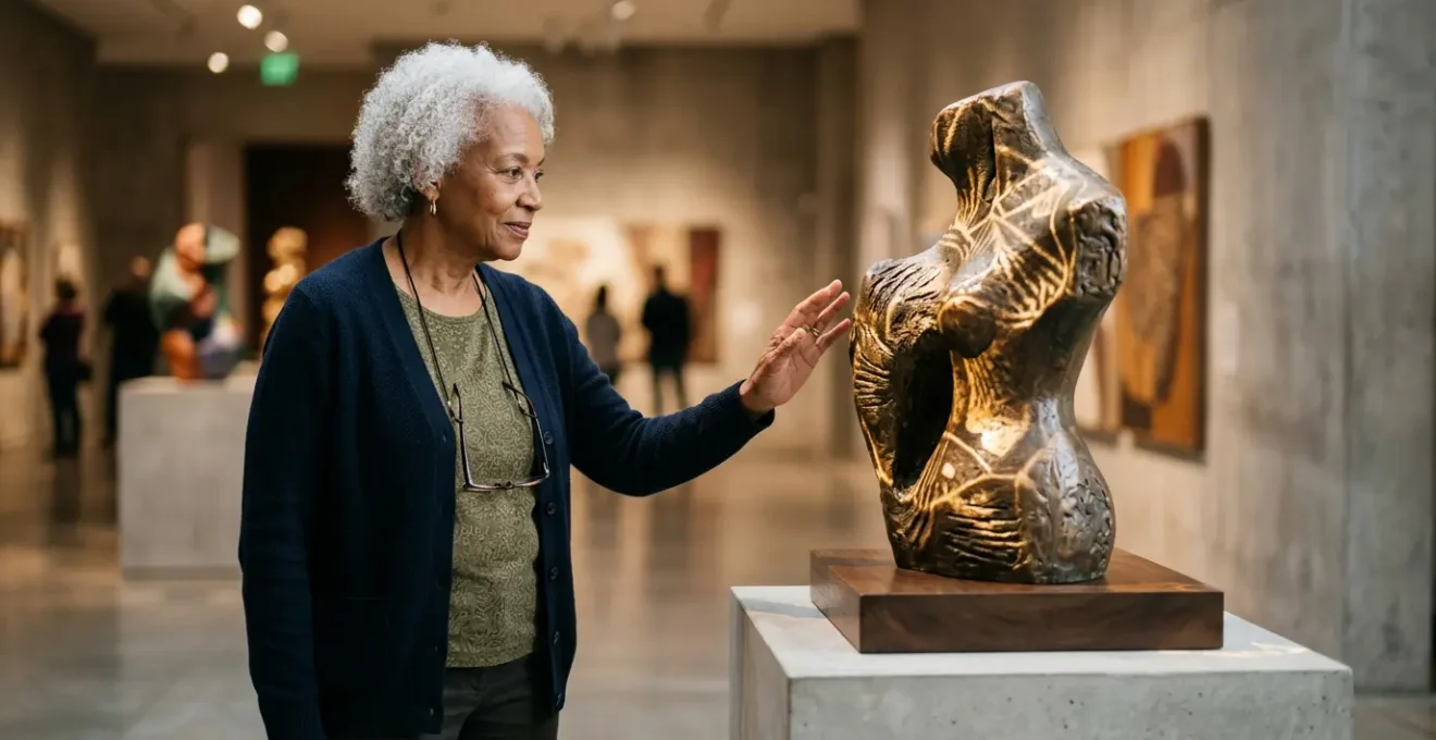
How to Blend Physical Sculptures with Digital Projections Without Forcing Users to Wear Headsets?
The magic of hybrid exhibitions lies in creating sensory cohesion, where the physical and digital feel like two parts of a single, unified reality. Forcing visitors to wear VR or AR headsets immediately shatters this cohesion. It erects a physical and psychological barrier, isolating them from the shared social space of the gallery and often causing disorientation or discomfort. The most elegant solution to this challenge is projection mapping, a technique that turns any physical surface—from a sculpture to an entire room—into a dynamic canvas.
Projection mapping allows digital light and animation to “wrap” around a three-dimensional object. This technique respects the physical presence of the artwork while augmenting it with layers of narrative, color, and movement. A static white sculpture can appear to change material, pulse with light, or reveal its internal structure, all without requiring the visitor to wear any special equipment. This creates a collective, communal experience where everyone in the room sees the same magical transformation, fostering conversation and shared wonder.
The power of this approach is its ability to transform an object’s story moment by moment. As the team at Wonderful Museums notes in their article “Immersive Art Museums: Stepping Into the Canvas”:
Projection mapping allows for constant movement and transformation. A serene landscape can morph into a stormy sea, abstract shapes can swirl and dance, or historical figures can come to life, all within the same physical space.
– Wonderful Museums editorial team, Immersive Art Museums: Stepping Into the Canvas
This technique is not just theoretical; it has been successfully implemented to create highly engaging and usable exhibits. The following case study demonstrates its effectiveness in a real-world museum setting.
Case Study: The Gaia System at Sortland Museum
The Gaia System, an interactive tabletop projection mapping installation at the Sortland Museum in Norway, serves as a powerful example. It was designed to support both multi-user interaction and guided tours without headsets. A field study involving 32 participants yielded a System Usability Scale (SUS) score of 84.14, which is considered excellent. Participants found the projection technology impressive and the content informative, confirming that headset-free projection mapping is a highly effective and user-friendly infrastructure for modern museum exhibitions.
By using the artwork itself as the screen, you are not adding a layer of technology on top of the experience; you are infusing the art with a new, dynamic dimension that every visitor can share together.
The Cable Management Disaster That Creates Severe Trip Hazards in Darkened Rooms
Exposed cables in a darkened gallery are more than just an aesthetic failure; they are a fundamental breach of trust with the visitor. This is an issue of infrastructural empathy—the practice of designing the physical environment with the same user-centric care as the digital interface. A stray power cord or a mess of wires near an exhibit creates a tangible trip hazard, but it also sends a powerful subconscious message: this space is not entirely safe. This low-level anxiety distracts from the art and undermines the feeling of emotional safety that is crucial for a positive museum experience.
In a darkened room, where a visitor’s visual focus is meant to be on illuminated artworks, their peripheral awareness is diminished. An unexpected obstacle on the floor can easily lead to a fall, turning an immersive experience into a dangerous one. Moreover, poorly managed cables reflect a lack of professionalism and care, subtly devaluing the exhibition itself. The solution is to treat cable management not as an afterthought but as an integral part of the exhibition’s design from the very beginning.
This means planning cable routes with the same intentionality as visitor pathways. As outlined in professional strategies for event safety, effective management involves using dedicated floor cable covers or conduits that protect wires and eliminate trip hazards. In high-traffic areas, heavy-duty covers are essential. Furthermore, it’s vital to ensure all power strips and cables meet safety standards to prevent overheating, especially in enclosed plinths or behind walls. Planning for modularity and accessible maintenance hatches also prevents a single point of failure from derailing the entire experience.
The ideal solution integrates cable management directly into the architecture of the space, as shown in the image below, making it an invisible and seamless part of the gallery’s infrastructure.
This clean, intentional design reinforces the sense of a controlled, professional, and safe environment. It allows the visitor to move freely and confidently, fully immersing themselves in the art without worrying about what might be underfoot. It is the physical manifestation of respect for the visitor’s well-being.
By practicing infrastructural empathy, you build a foundation of trust that allows for more ambitious and immersive digital storytelling, secure in the knowledge that the visitor’s basic need for safety has been met.
Passive Video Projections or Interactive Touchscreens: Which Engages Casual Audiences Longer?
The answer to this question depends entirely on the visitor’s interaction threshold—the mental and physical energy they are willing to expend to engage with an exhibit. There is no single “better” option; a successful exhibition offers a balanced diet of both passive and active experiences, allowing visitors to choose their own level of engagement. A casual visitor, simply strolling through the gallery, is far more likely to be drawn in by a large-scale, passive video projection. It requires zero commitment.
Passive projections, like atmospheric loops or short, narrative films, have an interaction threshold of zero. Visitors can absorb them from a distance, while walking past, or by stopping for a few moments. This effortless engagement is highly inclusive and effective at setting a mood or telling a broad story to a large number of people simultaneously. It’s a “lean-back” experience that provides value without demanding anything in return, making it perfect for capturing the attention of the casual browser.
Interactive touchscreens, on the other hand, demand active participation. They represent a “lean-in” experience. A visitor must make a conscious decision to approach the screen, touch it, and navigate its content. This requires a higher cognitive investment and a willingness to cross the interaction threshold. While this can lead to deeper, more personalized engagement for motivated visitors, it can also be a barrier for those who are feeling tired, intimidated, or simply not in the mood to “work” for information. The key is that the perceived reward must outweigh the perceived effort.
Therefore, the most effective strategy is to use both in concert. Use large, beautiful, passive projections to create an immersive atmosphere and draw visitors into a space. Then, offer optional, interactive touchscreens nearby for those who want to dive deeper. This layered approach respects the different mindsets and energy levels of your audience. The passive projection serves as the invitation, while the interactive screen serves as the deeper conversation for those who accept it. This ensures that every visitor, from the fleeting passerby to the dedicated scholar, can find a rewarding level of engagement.
By providing a mix of experiences, you empower visitors to craft their own journey through the exhibit, creating a more satisfying and inclusive experience for all.
When Should Gallery Attendants Intervene to Help a Struggling User with the Tech?
The role of a gallery attendant in a hybrid exhibition extends far beyond security; they are crucial emotional safety facilitators. Their intervention should be preemptive, gentle, and framed as an invitation, not a correction. The right moment to intervene is not after a visitor has given up in frustration, but in the subtle moment of hesitation just before it. This requires keen observation and a high degree of emotional intelligence.
Attendants should be trained to recognize the tell-tale signs of cognitive friction: a furrowed brow, a tentative and withdrawn hand, repeated and unsuccessful tapping on a screen, or a nervous glance around to see if anyone is watching. This is the critical window. Intervening at this point prevents frustration from setting in and transforms a potentially negative experience into a positive, supported one. The goal is to make the visitor feel helped, not helpless.
The approach is everything. An attendant should never rush over and take the controls, which can feel patronizing. Instead, a successful intervention might start with a soft, open-ended question like, “It’s an interesting piece, isn’t it? Would you like a quick pointer on how it works?” This phrasing preserves the visitor’s autonomy and frames the offer as a shared exploration rather than a rescue mission. The attendant acts as a friendly guide, empowering the user by explaining the ‘why’ behind the interface, not just the ‘how’. A simple phrase like, “The designer made this button extra large so it’s easy to press without worrying,” can instantly build confidence.
Training is paramount. Staff should be intimately familiar with every interactive element, including common failure points and simple troubleshooting steps. They should role-play different intervention scenarios to practice their approach and language. By positioning attendants as knowledgeable and approachable hosts, the museum creates a powerful human safety net that ensures technology serves as a bridge, not a barrier. Their presence reassures visitors that it’s okay to be curious and even to struggle, because a helping hand is always nearby.
Ultimately, a well-timed, empathetic intervention can be the single most important factor in making a technologically rich exhibition feel genuinely welcoming to everyone.
When Should Curators Schedule Dedicated Quiet Hours for Sensory Installations?
Curators should schedule dedicated quiet hours for sensory installations whenever an exhibit features intense, overlapping, or persistent audiovisual elements. This is not just a niche accommodation; it’s a fundamental act of inclusive design that broadens the museum’s welcome to a significant portion of the population. These quiet hours are essential for visitors with sensory sensitivities, such as those on the autism spectrum, as well as individuals with anxiety, PTSD, or simply a preference for a more contemplative environment.
A standard museum environment can be a sensory minefield. The cacophony of competing soundscapes from different installations, flashing lights, and the ambient noise of crowds can quickly lead to sensory overload. For someone with heightened sensitivity, this overload is not just uncomfortable; it can be physically painful and emotionally distressing, forcing them to cut their visit short. Quiet hours directly address this by creating a predictable and controlled sensory environment.
During these dedicated times, the museum actively reduces the sensory load. This might involve:
- Lowering the volume of all audio elements or turning some off completely.
- Slowing down or simplifying flashing or fast-moving video projections.
- Reducing the overall ambient lighting to a more subdued level.
- Limiting the number of visitors allowed in the gallery at one time to reduce crowding and ambient noise.
This proactive measure transforms the space from potentially hostile to genuinely welcoming. It communicates to visitors that their well-being is a priority and that the museum is a place where they can feel safe and comfortable.
Scheduling these hours should be done thoughtfully and communicated clearly on the museum’s website and ticketing platforms. Offering them on a regular, predictable basis—for instance, the first Sunday morning of every month—allows visitors who need them to plan their trip with confidence. By implementing quiet hours, curators are not “dumbing down” the artistic intent of an installation; they are offering an alternative, equally valid way to experience it. It is an acknowledgment that there is more than one way to see, hear, and feel art.
In doing so, museums can live up to their promise of being truly public institutions, open and accessible to all members of their community.
When Should Physical Artworks Exist Entirely Independently of Their Digital Twins?
A physical artwork should exist entirely independently of its digital twin when the digital layer risks undermining the primary, intended experience of the original piece. The first rule of hybrid design is “do no harm.” If a digital augmentation distracts from, complicates, or otherwise diminishes the viewer’s direct, unmediated connection with the physical art, then it is better to let the artwork stand alone. This is an essential curatorial decision rooted in respect for both the art and the viewer.
This principle is most critical for artworks whose power lies in their materiality, subtlety, or contemplative nature. Consider a delicate watercolor where the artist’s genius is visible in the bleed of the pigment on the paper, or a massive, minimalist sculpture whose impact comes from its silent, imposing presence in a room. Pointing a phone at it to see an AR overlay of dancing figures or historical facts could shatter that quiet, profound connection. The digital twin, in this case, becomes a noisy distraction, pulling the viewer’s attention away from the very qualities that make the artwork special.
The decision for independence also arises when the digital experience cannot meaningfully add to the physical one. A digital twin should offer a new perspective, a deeper layer of understanding, or a transformative aesthetic experience. If the digital component is merely a gimmick—a simple 3D model of the object you’re already looking at, for example—it provides no real value and only serves to introduce a needless technological step. It creates cognitive friction for no discernible reward. In these cases, the digital layer feels like a solution in search of a problem.
The choice to keep an artwork independent is not an anti-technology stance; it is a pro-art one. It acknowledges that some experiences are complete and perfect in their original form. A successful hybrid exhibition is a well-paced one, with a rhythm of both digitally-enhanced pieces and quiet, traditional moments. This allows visitors to rest their minds and simply *look*. By making conscious decisions about when *not* to add a digital layer, a curator demonstrates a deep understanding of the art and a profound respect for the visitor’s experience.
Sometimes, the most powerful digital intervention is no intervention at all.
Key Takeaways
- Prioritize Cognitive Fluency: Design interfaces that are so simple and predictable they become invisible, allowing visitors to focus on the art, not the technology.
- Build Emotional Safety: Create a forgiving, non-judgmental environment—through both interface design and staff interaction—where visitors feel confident to explore without fear of failure.
- Practice Infrastructural Empathy: Treat the entire physical space, from cable management to lighting, as an integral part of the user experience to build a foundation of trust and safety.
How to Integrate Augmented Reality Overlays into Traditional Canvas Displays?
Integrating Augmented Reality (AR) over traditional canvas displays requires a delicate touch, prioritizing a low interaction threshold and leveraging technology visitors already own and understand: their own smartphones. Forcing visitors to use unfamiliar, museum-provided tablets or clunky AR glasses immediately creates a barrier. By designing an AR experience that works through a dedicated, easy-to-download museum app, you tap into a device that is already an extension of the user, dramatically lowering cognitive friction.
The process should be seamless. Upon opening the app and pointing their phone’s camera at a designated painting, the AR overlay should activate automatically. This overlay shouldn’t obscure the art but enhance it. For example, it could reveal the artist’s original sketches hidden beneath the final layers of paint, animate a static figure to play out a short narrative moment, or translate a symbolic element into its historical meaning with floating, unobtrusive text. The goal is to provide a “secret window” into the artwork’s story, not to plaster it with digital graffiti.
Clear and simple signposting is essential for emotional safety. A small, elegant icon next to the painting’s physical label, indicating that an AR experience is available, is all that’s needed. The icon should be consistent throughout the exhibition. The app itself must be designed for absolute simplicity, with a one-tap process to activate the camera. The experience should also be optional. Visitors who prefer to simply view the painting should not feel they are missing out; the AR should be positioned as an extra layer of discovery for the curious.
Furthermore, consider the physical environment. Ensure the gallery has robust, free Wi-Fi to facilitate app downloads and smooth operation. Lighting must be carefully controlled to avoid glare on the canvas, which can interfere with the camera’s ability to recognize the artwork. By designing the AR experience around the visitor’s own device and paying close attention to these environmental and interface details, you can add a rich, interactive dimension to traditional art without alienating or frustrating your audience.
By putting the user’s comfort and familiarity first, you can successfully merge the timeless beauty of canvas painting with the dynamic storytelling power of augmented reality, creating a truly hybrid experience.