Contrary to popular belief, achieving an authentic oil paint look isn’t about finding the perfect brush pack; it’s about mastering the physics of digital paint behavior.
- Custom pressure curves and brush engine settings are more critical than the brush tip shape itself for creating realistic texture and flow.
- Strategic use of blending modes like Multiply and Color Dodge mimics traditional glazing and scumbling, creating depth that a simple texture overlay cannot.
Recommendation: Stop hunting for the “magic brush” and start deconstructing the dynamics of your current tools to translate the physical properties of paint into your digital workflow.
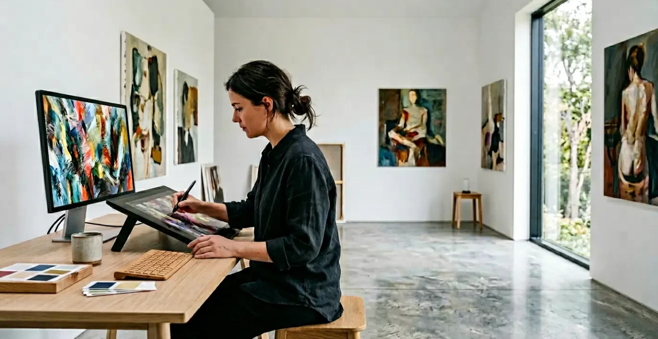
For the commercial illustrator, the challenge is perennial: how to infuse the soul, texture, and organic depth of traditional oil painting into digital work constrained by tight deadlines. Many artists fall into the trap of downloading hundreds of brushes or overlaying a generic canvas texture, only to find their work still feels sterile and unmistakably digital. This approach treats the problem as a surface-level issue, a matter of finding the right preset to apply over the top of a finished painting.
The common advice—use textured brushes, work on a high-resolution canvas—only scratches the surface. These are components of the solution, but they are not the solution itself. The real magic of oil paint lies in its physical behavior: its viscosity, the way light passes through translucent glazes, the chaotic interaction of bristles on canvas, and the buildup of impasto. Simply faking this “look” with a static texture fails to capture the dynamic, living quality of a real painting.
But what if the key was not to fake the look, but to translate the *physical behavior* of paint into your digital tools? This guide departs from the conventional wisdom of presets and overlays. We will explore how to deconstruct the fundamental properties of oil paint and replicate them by manipulating your software’s core mechanics. It’s a shift from being a user of tools to becoming a master of the digital medium’s underlying physics.
This article will guide you through mastering brush engine dynamics, strategic layer glazing, and performance optimization. We will also examine the psychological impact of a “painterly” feel in client work and how principles from physical drafting can bring structure to your most complex digital creations. Prepare to fundamentally change how you approach digital texture.
Summary: Replicating Authentic Oil Paint Textures in Commercial Digital Illustration
- Why Do Custom Pressure-Sensitive Brushes Dramatically Improve Digital Realism?
- How to Layer Blending Modes to Mimic Traditional Canvas Glazing Techniques?
- The High-Resolution Canvas Mistake That Crashes Entry-Level Drawing Tablets
- Subscription Software or One-Off Purchase Raster Apps: Which is More Cost-Effective?
- When Should You Flatten Complex Layer Hierarchies to Save Processing Power?
- How to Anchor 3D Animations to Oil Paintings Without Altering Gallery Lighting?
- Why Do Hand-Drawn Concept Sketches Secure More Client Approvals Than 3D Renders?
- How to Integrate Physical Drafting Methods into Modern Architectural Workflows?
Why Do Custom Pressure-Sensitive Brushes Dramatically Improve Digital Realism?
The pursuit of digital realism often begins and ends with a frantic search for the “perfect” oil brush. Yet, the secret to a convincing painterly effect lies not in the brush tip’s texture, but in mastering the brush engine physics that govern its behavior. A default brush, no matter how well-designed, is calibrated for a generic user. A custom-tuned brush, however, becomes a true extension of your hand, responding to the unique pressure and velocity of your individual strokes. This is the foundation of creating organic, non-uniform textures that mimic real-world paint.
True digital realism emerges when multiple parameters are linked to pressure sensitivity. It’s not just about size variation. By mapping pressure to opacity, flow, texture depth, and color mixing simultaneously, a single stroke can transition from a thin, watery wash to a thick, opaque impasto. This creates what can be described as digital viscosity—the illusion that you are moving a viscous medium, not just coloring pixels. The subtle, chaotic variations in paint accumulation and bristle splay that occur naturally in traditional painting can be simulated through precise control of flow jitter and bristle dynamics settings.
As the case study on GrutBrushes highlights, professional artists value brushes that provide a sense of holding a real tool, complete with tilt, pressure, and flow sensitivity. This tactile feedback is a direct result of meticulously configured brush dynamics. Rather than collecting hundreds of pre-made brushes, the master artist learns to build or modify a small, versatile set that perfectly matches their style and hardware. This control over the tool’s core behavior is the first and most critical step in moving beyond a flat, digital look to one with authentic depth and texture.
Action Plan: Calibrating Your Brush for Oil Simulation
- Calibrate brush tracking to match your personal stroke pressure and velocity preferences.
- Map pressure sensitivity to multiple parameters simultaneously (opacity, size, texture depth).
- Adjust bristle splay settings to simulate real brush deformation at different pressure levels.
- Configure flow jitter to create natural paint accumulation patterns.
- Test wavy strokes on a scratch pad to verify the dynamic response matches your intended style.
How to Layer Blending Modes to Mimic Traditional Canvas Glazing Techniques?
Achieving the luminous depth of an oil painting digitally requires moving beyond the simple concept of layer opacity. Traditional masters built up color through glazing—applying thin, transparent layers of paint that allow light to pass through and reflect off the layers below. This cannot be replicated by just lowering a layer’s opacity slider. The key is to leverage blending modes to simulate this complex interaction of light and pigment, a concept we can call layer translucency. Blending modes are mathematical formulas that dictate how a layer’s pixels interact with the pixels on the layers beneath it, offering a far more nuanced approach than simple transparency.
For example, the Multiply blending mode is the digital equivalent of a dark glaze. It darkens the underlying colors by multiplying their brightness values, creating rich, transparent shadows without turning them muddy. Conversely, Screen or Lighten modes are perfect for scumbling—the technique of applying a light, opaque color over a dark layer to create hazy highlights and texture. Using these modes at low opacities (10-40%) builds up subtle shifts in color and value that feel integrated and natural, rather than “pasted on.” For brilliant, jewel-like highlights that mimic a dab of thick, wet paint catching the light, the Color Dodge mode at a very low opacity (5-25%) is unparalleled.
By thinking in terms of traditional techniques, you can build a logical and effective layer strategy. This systematic approach not only produces more realistic results but also maintains a non-destructive workflow, allowing you to adjust the intensity of each “glaze” or “scumble” independently. The following table breaks down this direct translation from physical to digital.
| Traditional Technique | Digital Equivalent | Blending Mode | Opacity Range |
|---|---|---|---|
| Glazing (Dark) | Transparent shadow layers | Multiply/Color Burn | 10-40% |
| Scumbling | Dry brush highlights | Screen/Lighten | 15-50% |
| Impasto Highlights | Thick paint accents | Color Dodge | 5-25% |
| Underpainting | Value foundation | Color Mode | 30-60% |
The High-Resolution Canvas Mistake That Crashes Entry-Level Drawing Tablets
The conventional wisdom for illustrators is “bigger is better” when it comes to canvas resolution. The logic seems sound: a high-resolution file (e.g., 600 DPI at A3 size) captures more detail and allows for large-format printing. However, for a commercial illustrator on a tight deadline with an entry-level or mid-range drawing tablet, this approach can be counterproductive. An excessively large canvas, especially when combined with complex, texture-heavy brushes and dozens of layers, places immense strain on a system’s RAM and GPU. The result is crippling brush lag, slow file saves, and, in the worst cases, software crashes that can derail a project.
The mistake is not in valuing high resolution, but in failing to balance resolution with performance. The rapidly expanding digital art market, with the digital illustration app market projected to reach USD 25.32 Billion by 2034, means more artists are entering the field with a wide range of hardware capabilities. A workflow optimized for a high-end studio machine will not work for a freelancer on a portable device. The key is to define the canvas size based on the project’s *actual* final delivery requirements, not an arbitrary standard of “highest possible quality.”
For most commercial web and small-print work, a resolution of 300 DPI at the final print size is more than sufficient. Working at 1.5x the final required dimension provides enough buffer for cropping and minor adjustments without unnecessarily taxing the system. It is far more efficient to work on a responsive, moderately-sized canvas and upscale the final, flattened image using modern interpolation algorithms if a larger version is unexpectedly required. Prioritizing a smooth, lag-free painting experience over a bloated file size leads to better art, as it allows for more fluid, confident, and expressive strokes—qualities essential for a painterly aesthetic.
Subscription Software or One-Off Purchase Raster Apps: Which is More Cost-Effective?
The choice of creative software is no longer a simple one. The market is divided between comprehensive subscription ecosystems like Adobe Creative Cloud and powerful, specialized one-time purchase applications like Clip Studio Paint or Rebelle. For the commercial illustrator focused on painterly textures, the decision hinges on a careful analysis of cost versus features. A subscription offers constant updates, cloud integration, and a vast suite of tools, but represents a significant recurring expense. A one-off purchase has a higher initial barrier for premium versions but offers long-term savings and freedom from monthly fees.
The most cost-effective solution is rarely a one-size-fits-all answer. An artist working across multiple disciplines (e.g., illustration, graphic design, and video) may find the all-in-one nature of a subscription indispensable. However, an illustrator who spends 90% of their time in a raster painting environment might be better served by a specialized, perpetual-license app that excels at one thing: paint simulation. Rebelle, for example, is renowned for its hyper-realistic fluid dynamics, a feature that may be more valuable for creating organic textures than the breadth of tools in a larger suite.
Increasingly, professional artists and studios are adopting a hybrid approach. They might maintain a core subscription for its collaborative features and industry-standard file compatibility, while supplementing it with a specialized one-off purchase app for specific stylistic needs. This allows them to leverage the best of both worlds: the power of an ecosystem and the focused excellence of a dedicated tool. As studios increasingly combine core subscriptions with specialized apps for specific artistic styles, a trend confirmed by recent analysis of freelance artist growth, this flexible model is proving to be both artistically and financially sound.
| Software Type | Initial Cost | 3-Year Total | Key Features | Best For |
|---|---|---|---|---|
| Adobe Creative Cloud | $59.99/month | $2,159 | Full ecosystem, cloud sync, AI tools | Multi-discipline professionals |
| Clip Studio Paint Pro | $49.99 once | $49.99 | Specialized manga/illustration tools | Dedicated illustrators |
| Rebelle 5 Pro | $149.99 once | $149.99 | Advanced paint simulation | Traditional media artists |
| Hybrid Approach | Variable | ~$800 | Core subscription + specialized apps | Commercial studios |
When Should You Flatten Complex Layer Hierarchies to Save Processing Power?
In digital illustration, layers are a double-edged sword. They offer unparalleled flexibility and a non-destructive workflow, but an overly complex hierarchy with hundreds of layers, masks, and blending modes can cripple system performance. For an artist striving for an organic, painterly feel, this performance lag is death to creative flow. The key is not to avoid layers, but to know strategically when to commit and flatten them to maintain the structural integrity of your file and workflow.
Flattening should not be a haphazard process done at the very end. It should be a series of deliberate decisions made at key milestones in the illustration process. The guiding principle is to merge layers whose foundational elements are approved and unlikely to change. For example, once the client has signed off on the overall color palette and base character colors, those layers can be merged. Similarly, background atmosphere and foundational lighting layers are often early candidates for flattening, as they form the canvas upon which the detail work is built. This progressive consolidation frees up valuable RAM and CPU resources for the most intensive part of the process: the final 20% of detailing.
This approach mirrors traditional painting, where an artist builds upon a dried underpainting. The commitment is a feature, not a bug, forcing more confident and deliberate mark-making. As one professional artist notes, this philosophy can directly benefit the final aesthetic:
The best advice is to paint on just one or as few layers as possible. When you work more like a traditional painter your paintings tend to look more like traditional mediums.
– Professional Digital Artist, Muddy Colors Digital Painting Tutorial
Before flattening any complex group, always create a backup, either by duplicating the layer group or converting it into a smart object. This provides a safety net while allowing you to reap the performance benefits of a leaner file. The following framework provides a clear guide for making these strategic decisions.
Checklist: Strategic Layer Flattening Framework
- Identify layer groups consuming the most processing power (typically those with multiple blending modes).
- Create a smart object backup before flattening any complex group.
- Flatten background atmosphere layers once the overall lighting is finalized.
- Merge character base colors after the client has approved the color palette.
- Keep the top 20% of detail and texture layers separate for potential revisions.
How to Anchor 3D Animations to Oil Paintings Without Altering Gallery Lighting?
The intersection of traditional aesthetics and digital technology is creating new frontiers for commercial art, particularly in augmented reality (AR) and immersive experiences. A major challenge is integrating 3D elements or animations with painterly 2D assets without shattering the illusion. If a 3D model reacts to virtual scene lighting while the “painted” background does not, the result is a jarring disconnect. The solution lies in a technique used by VFX artists and game developers: the unlit shader workflow. An unlit (or shadeless) material in a 3D application ignores all scene lighting, deriving 100% of its color, texture, and light information from its base texture map.
This is a game-changer for digital painters. By creating a high-resolution painting and exporting it as a texture map, you can apply it to a 3D model using an unlit shader. The 3D object will then display your painting exactly as you created it, with all its rich, hand-painted lighting and texture intact, regardless of the lighting in the 3D or AR environment. This ensures the aesthetic integrity of your painterly style is preserved, creating a seamless blend between the 2D art and the 3D form. It allows an artist’s signature brushwork and color choices to be the sole driver of the visual experience.
This technique is not just theoretical; it’s a driving force in creating high-value commercial and artistic experiences. For instance, major retailers and museums are using AR installations to create unique visitor engagements. By using unlit shaders, artists can project painterly animations onto physical products or create interactive gallery pieces where the artwork appears to come alive while maintaining its core aesthetic. This method anchors the animation to the painting’s world, rather than forcing the painting into the jarringly clean world of 3D lighting, preserving the organic feel that is so difficult to achieve.
Why Do Hand-Drawn Concept Sketches Secure More Client Approvals Than 3D Renders?
In a world of photorealistic 3D renders and sophisticated AI-driven design, it seems counter-intuitive that a simple, hand-drawn sketch often secures client buy-in more effectively. Even as a 2024 Adobe survey found that over 73% of professionals now use AI in their creative workflows, the power of the sketch persists. The reason is psychological: a sketch is a proposition, while a perfect render is a declaration. The perceived “incompleteness” of a sketch, with its loose lines and suggestive forms, invites collaboration. It signals to the client that their input is not only welcome but necessary to bring the idea to completion.
This collaborative opening is lost in a flawless 3D render. A photorealistic image can feel so final and polished that clients may be intimidated to suggest changes, fearing it would require a complete overhaul. Worse, they may focus on minor, superficial details (like the color of a single object) because the “big picture” appears immutable. A sketch, by contrast, focuses the conversation on the core concept, composition, and emotion. It is a tool for alignment on the fundamental idea, not the final execution. This is the power of intentional imperfection.
The painterly quality itself contributes to this effect. The subtle variations in line weight and edge softness, a hallmark of traditional media, make a digital sketch feel more human and approachable. As one case study on digital painting techniques notes, edge variation is a critical, often-overlooked skill. By pushing, pulling, and smudging digital paint over a line drawing, artists create a variety of hard and soft edges that mimic the way real paints mix and contaminate on a surface. This variety adds a “painterly” feel that is inherently more suggestive and less rigid than the mathematically perfect edges of a basic 3D model, making it a more effective tool for early-stage client communication.
Key Takeaways
- Authentic digital texture comes from simulating the physical behavior of paint, not from presets. Master your brush engine’s dynamics for pressure, flow, and viscosity.
- Use blending modes strategically to mimic traditional techniques like glazing (Multiply) and scumbling (Screen) to build luminous, realistic depth.
- Balance canvas resolution with system performance. A smooth workflow on a moderately-sized canvas produces better art than a laggy experience on a massive one.
How to Integrate Physical Drafting Methods into Modern Architectural Workflows?
While seemingly distant from oil painting, the discipline of physical drafting offers powerful and relevant principles for the commercial illustrator. At its core, drafting is the art of building a complex image from a foundation of structure, proportion, and perspective. Before a single detail is rendered, the drafter establishes a “wireframe” that ensures the final composition is sound. This methodical approach—from broad strokes to fine detail—is directly applicable to creating complex, multi-element digital illustrations. By integrating drafting principles, an illustrator can bring a sense of order and structural integrity to even the most chaotic and expressive painterly works.
This doesn’t mean returning to T-squares and vellum. It means adopting the *mindset* of a drafter. Start with a simple, structural sketch to lock down composition and perspective. Use guides, grids, and perspective tools in your software to build a solid foundation before you lay down a single textured brushstroke. This foundational work ensures that as you add layers of painterly detail, the underlying drawing remains strong and coherent. It prevents the common problem where an illustration, despite having beautiful textures, feels “off” due to weak perspective or poor composition.
The evolution of the technical illustration field, where the global technical illustration software market is expected to reach USD 9.33 billion by 2033, shows that this blend of precision and technology is more relevant than ever. Modern tools, including AI-powered layout assistants, are not replacing foundational principles but are augmenting them. An illustrator who understands the classical rules of structure is best equipped to leverage these new technologies effectively. This synthesis of old-world discipline and new-world technology is the ultimate goal, allowing for the creation of art that is both technically sound and soulfully expressive.
By shifting your focus from chasing presets to mastering the underlying physics and principles of your craft, you can begin to create digital work with the timeless depth and texture of a traditional oil painting. Start today by choosing one technique—be it brush calibration or strategic glazing—and integrate it into your professional workflow.