The flawless scaling of textile patterns is not a design task, but a technical discipline of digital-to-physical translation that anticipates and neutralizes production failures before they occur.
- Vector-based mathematical paths are non-negotiable as they maintain perfect resolution at any scale, unlike pixel-based raster graphics which degrade.
- Vibrant screen colours (RGB) will inevitably mutate on fabric; a rigorous CMYK soft-proofing process using fabric-specific ICC profiles is essential.
Recommendation: Adopt a formal production handoff protocol for every file, including outlined fonts, expanded effects, and optimized anchor points to prevent catastrophic failures at the industrial printing stage.
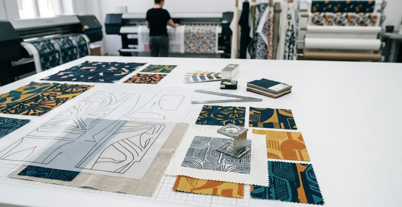
For the surface pattern designer, the transition from a pristine digital file on a 27-inch screen to a 50-meter roll of printed fabric is fraught with peril. A common frustration is seeing a complex, beautiful pattern degrade into a pixelated or blurry mess when scaled up for commercial production. This loss of resolution is a costly and entirely preventable failure. Many designers believe the solution lies in simply using high-resolution raster files or ticking a “vector” checkbox, but this superficial understanding misses the core of the problem.
The standard advice to “use vector” or “check your colours” is correct, but dangerously incomplete. It fails to account for the physical realities of industrial printing: the way ink absorbs into different fibers, how a machine’s Raster Image Processor (RIP) interprets complex files, or the subtle weight changes that occur when live text is converted for production. The challenge isn’t just about scaling; it’s about a precise and unforgiving process of digital-to-physical translation.
This guide abandons generic advice. Instead, it offers a veteran technician’s perspective from the production floor. We will dissect the fundamental reasons why mathematical algorithms are superior to pixels, establish the protocols for preparing complex files for industrial machinery, and reveal the specific CMYK conversion errors that cause beautiful screen colours to die on fabric. This is not about design theory; it is about the technical rigour required to ensure what you create on screen is exactly what rolls off the press.
This article provides a systematic approach to mastering the technical challenges of textile pattern scaling. Each section addresses a critical failure point in the workflow, from foundational file choices to final production handoff, ensuring your visual assets retain their integrity from pixel to print.
Summary: How to Scale Commercial Textile Patterns Without Losing Resolution Quality?
- Why Do Mathematical Path Algorithms Outperform Pixel Scaling for Large Prints?
- How to Prepare Complex Vector Files for Industrial Fabric Printing Machines?
- The CMYK Conversion Error That Mutates Vibrant Screen Colours on Printed Silk
- Desktop Vector Suites or iPad Drawing Tools: Which Streamlines Fashion Workflows?
- When is the Crucial Moment to Convert Live Fonts into Outlined Shapes?
- Why Do Flat-Colour Character Designs Transfer Better to Embroidered Merchandise?
- How to Scale Down Extreme Proportions While Retaining the Original Design DNA?
- How to Transition Freelance Visual Assets into Licensed Brand Merchandising?
Why Do Mathematical Path Algorithms Outperform Pixel Scaling for Large Prints?
The foundational choice between vector and raster is the single most important decision in textile design for large-scale production. A raster image is a grid of pixels; when you enlarge it, the software must guess at the new pixels to fill the gaps, a process called interpolation. This inevitably leads to blurriness, blockiness, and a catastrophic loss of sharpness. A vector graphic, conversely, is not composed of pixels but of mathematical equations defining paths, curves, and points. When you scale a vector, you are simply re-calculating the math, resulting in infinite scalability with zero resolution loss.
This concept of path integrity is paramount. For a textile pattern that may be repeated across dozens of meters of fabric, every line must remain perfectly crisp. The mathematical precision of Bézier curves ensures that an ornate floral motif is as sharp on a 10-centimeter sample as it is on a 2-meter wide fabric roll. Pixel-based attempts will always fail this test under magnification, revealing jagged edges that are unacceptable in commercial fashion.
As the illustration above demonstrates, the difference is not subtle; it is absolute. The smooth, continuous nature of the vector path on the left maintains its form, while the pixel-based version on the right fragments. To properly leverage this, designers must commit to a true vector workflow. This includes creating patterns on small, manageable tiles (e.g., 10x10cm) and using global color swatches, which allow for consistent color management across all instances of the repeating pattern, ensuring both shape and color maintain their integrity at any scale.
How to Prepare Complex Vector Files for Industrial Fabric Printing Machines?
A correctly built vector file is only half the battle. Preparing it for the specific demands of an industrial fabric printer requires a rigorous pre-flight protocol. Industrial RIP software is notoriously sensitive and can easily crash or misinterpret files that contain live effects, open paths, or an excessive number of anchor points. Each of these elements introduces a variable that can lead to production-halting errors. The goal is to deliver a ‘clean’ and ‘flat’ file that leaves no room for interpretation by the machine.
This preparation becomes even more critical for engineered prints, where the design must fit precisely onto specific garment pattern pieces. A failure to account for seam allowances or to properly align the design within the standardized blocks can render an entire print run useless.
Case Study: PatternLab’s Advanced Engineered Print Technique
PatternLab London exemplifies the required precision for industrial handoff. Their process involves designing prints specifically for standardized garment blocks. By doing this, they ensure the vector files are prepared with perfect pattern alignment and correct seam allowance calculations before the file is ever sent to the printer, eliminating alignment errors during manufacturing.
To avoid these issues, a technical checklist is not just recommended; it is mandatory. Before exporting the final production file, every element must be verified. This systematic approach ensures that the digital file translates perfectly into a physical product without costly errors or delays.
The following pre-flight checklist outlines the essential steps for hardening a vector file for industrial use. As a thorough analysis of fashion design workflows shows, failing to address these points is the most common source of technical problems between designer and manufacturer.
| File Element | Required State | Common Error | Solution |
|---|---|---|---|
| Anchor Points | Optimized (minimal) | Thousands of unnecessary points | Simplify paths without altering design |
| Paths | All closed | Open paths causing fill issues | Join all endpoints |
| Fonts | Outlined | Missing fonts at printer | Convert to outlines after approval |
| Effects | Expanded | Live effects crash RIP | Expand appearance before export |
| Color Mode | CMYK verified | RGB causing color shifts | Convert with proper ICC profile |
The CMYK Conversion Error That Mutates Vibrant Screen Colours on Printed Silk
One of the most jarring moments for a designer is seeing their vibrant, luminous on-screen colors transform into dull, muddy shades on the final printed fabric. This phenomenon, known as gamut failure, is a result of the fundamental difference between the additive color model of a screen (RGB – Red, Green, Blue) and the subtractive color model of printing (CMYK – Cyan, Magenta, Yellow, Black). An RGB screen emits light and can produce millions of brilliant, electric colors that simply do not exist in the physical world of ink on paper or fabric.
The CMYK gamut is significantly smaller than the RGB gamut. When you convert an RGB file to CMYK, any color that falls outside the CMYK gamut (an “out-of-gamut” color) must be approximated using the closest available CMYK equivalent. This often results in a dramatic loss of saturation and vibrancy, particularly for bright blues, greens, and pinks. On a material like silk, which has its own unique texture and ink absorption properties, this color shift can be even more pronounced and unpredictable.
To prevent this, you cannot trust what you see on your screen. You must engage in a process called “soft proofing,” which uses a specific ICC profile provided by your printer to simulate how your colors will look on the final fabric. This allows you to identify and correct out-of-gamut colors before they ever go to print, saving you from a costly and disappointing production run. The key is to request the fabric-specific profile, as a profile for cotton will be different from one for silk or polyester.
Your Action Plan: The CMYK Soft Proofing Protocol
- Use sRGB when creating initial designs for the widest digital color range.
- Request the specific ICC profiles for each fabric you intend to print on from your textile printer.
- In Photoshop or Illustrator, enable “Gamut Warning” to visually identify all colors that are unprintable in the target CMYK space.
- Adjust these problem colors manually until the warning disappears, opting for the closest vibrant, in-gamut alternative.
- Order small 20x20cm printed fabric samples to verify your color choices in the real world before committing to a full production run.
Desktop Vector Suites or iPad Drawing Tools: Which Streamlines Fashion Workflows?
The debate between desktop software like Adobe Illustrator and mobile tools on the iPad (such as Illustrator for iPad or Procreate) is not about which is “better,” but which is appropriate for each specific stage of the fashion design workflow. Relying solely on one platform introduces significant friction and risk. A professional workflow leverages the unique strengths of each environment: the intuitive, rapid ideation of the iPad and the technical precision of the desktop.
iPad apps, paired with the Apple Pencil, offer an unparalleled experience for initial sketching and conceptualization. The drawing feel is natural and fast, allowing designers to capture ideas fluidly. However, these mobile environments often lack the robust technical features required for final production handoff. Critically, full ICC profile support for color management, advanced pattern-making tools, and comprehensive export options are the domain of desktop software.
The following table breaks down the key differences, highlighting where each platform excels. While an iPad is superb for concept art, the final, technical-grade file preparation for manufacturing must be done on a desktop to ensure full compatibility and control.
| Feature | Desktop Illustrator | iPad Illustrator/Fresco | Best For |
|---|---|---|---|
| Path Precision | Maximum control with mouse/tablet | Natural with Apple Pencil | Technical flats: Desktop |
| Color Management | Full ICC profile support | Limited profile options | Final production: Desktop |
| Pattern Tools | Complete pattern creation suite | Basic pattern features | Complex repeats: Desktop |
| File Compatibility | All formats supported | Some export limitations | Industry handoff: Desktop |
| Drawing Speed | Slower, more technical | Fast, intuitive sketching | Initial concepts: iPad |
Case Study: Brigitte Heitland’s Hybrid Workflow
Professional surface designer Brigitte Heitland has perfected a hybrid workflow that demonstrates this principle. According to a breakdown of her process, she begins with paper sketches, which are then scanned and vectorized on an iPad with Adobe Illustrator for a natural drawing feel. The crucial final step involves transferring the file to her desktop computer. There, she performs all final technical preparations, including precise color management and file formatting, before sending the production-ready assets to textile manufacturers.
When is the Crucial Moment to Convert Live Fonts into Outlined Shapes?
In textile design, typography is not text; it is a graphical element. The single most common and catastrophic error involving fonts is sending a file with ‘live’ text to a printer. If the printing facility does not have the exact same font file installed on their system, their software will automatically substitute it with a default font, completely destroying the design’s integrity. This is not a possibility; it is a certainty. The only way to prevent this is to convert all text into vector shapes, a process called ‘creating outlines’.
Once text is converted to outlines, it is no longer editable as text. It becomes a collection of fixed vector paths, just like any other illustration in the file. This guarantees that its appearance will be identical on any computer, regardless of installed fonts. However, this action is irreversible. The crucial moment to perform this conversion is therefore the very last step before handoff, after all textual content has been 100% approved and proofread by all stakeholders.
A disciplined production protocol is essential to manage this final, critical step without losing the ability to make future edits. The process is as follows:
- Confirm Final Approval: Get written confirmation from the client or brand manager that all spelling, grammar, and content is final and approved.
- Save a Master Copy: Immediately save a version of the file with the live, editable fonts. Name it clearly, for instance, `Pattern_Master_LiveText.ai`. This is your editable source file for any future changes.
- Create the Production Copy: Now, save a separate copy for the printer, named `Pattern_Production_Outlined.ai`. This distinction is crucial for version control.
- Select and Convert: In this new production file, select all text objects (using `Select > Object > Text Objects`) and apply the `Type > Create Outlines` command.
- Verify Conversion: Zoom in to check for any subtle weight or shape changes, especially on very small or delicate text. Ensure no font substitution warnings remain.
- Package and Deliver: Package this outlined file for the printer, confident that the typography will render perfectly.
Why Do Flat-Colour Character Designs Transfer Better to Embroidered Merchandise?
Transitioning a design from print to embroidery is a shift from two dimensions to three. Embroidery is not ink; it is thread, with physical thickness and limitations. The most significant limitation is the inability to smoothly replicate gradients. While a printer can blend CMYK dots to create a seamless gradient, an embroidery machine must approximate it by laying down different colored threads next to or on top of each other. This process, called thread blending, is problematic for several reasons.
First, it dramatically increases production complexity. A flat-color design translates directly: one color area equals one thread path. A gradient, however, requires the machine to stop, change thread, and run multiple complex paths to simulate the blend. As a case study from PatternLab shows, this can increase production time by 300% and require up to five different thread colors to approximate a single gradient, compared to the single spool setup for a flat color.
Second, the physical result is often poor. The density of stitches required to blend colors can cause the fabric to pucker and buckle. The threads can become knotted and create a messy, unintentional 3D texture, rather than a smooth visual transition. Flat-color designs, by contrast, allow for clean, crisp stitch paths with perfect thread tension, resulting in a high-quality, professional finish.
For any designer looking to license their characters for embroidered merchandise like hats or jackets, simplification is key. Converting complex, gradient-heavy illustrations into bold, flat-color vector versions is a necessary step in the digital-to-physical translation. This not only ensures a higher quality final product but also makes the design more commercially viable by keeping production costs and failure rates down.
How to Scale Down Extreme Proportions While Retaining the Original Design DNA?
While scaling up presents resolution challenges, scaling down poses a different problem: loss of legibility and detail. A complex, ornate pattern that looks beautiful at full width can dissolve into an illegible, muddy mess when shrunk to fit on a small product like a phone case or a necktie. Simply reducing the overall size is not a viable strategy. The key is to strategically simplify the design by removing detail according to a clear hierarchy, preserving the core essence or “DNA” of the pattern.
This process requires deconstructing your design into three layers of importance:
- Primary Elements: The core motifs that define the pattern’s character. These are non-negotiable and must be retained.
- Secondary Elements: Connecting graphics and supporting shapes that build the overall rhythm and flow of the pattern.
- Tertiary Details: The finest elements, such as micro-patterns, delicate textures, and tiny flourishes. These are the first to be sacrificed.
When scaling down significantly (e.g., to 25% of the original size), the tertiary details should be removed completely. Secondary elements should be simplified to their most basic shapes. Furthermore, the stroke weights of the remaining primary and secondary elements must be globally increased (often by 150-200%) before scaling down. This ensures they remain visually substantial and don’t disappear at the smaller size. The goal is to create a separate, dedicated “small-scale” version of the pattern, rather than using one master file for all sizes.
Finally, even with vectors, there is an absolute minimum resolution for scanning any hand-drawn elements that will be vectorized. As a technical baseline, industry experts recommend that artwork should be scanned at a minimum of 300 DPI, with 180 DPI being the absolute floor for acceptable quality. Starting below this threshold introduces degradation that even vectorization cannot fully repair.
Key Takeaways
- Always work with vector paths for textiles; their mathematical nature allows for infinite scaling without any loss of resolution.
- Anticipate gamut failure by using fabric-specific ICC profiles to soft-proof your colors, preventing vibrant RGB designs from becoming dull in CMYK print.
- Implement a strict pre-flight checklist before handoff: outline all fonts, expand all effects, and simplify anchor points to avoid RIP software crashes.
How to Transition Freelance Visual Assets into Licensed Brand Merchandising?
For a freelance designer, transitioning a successful visual asset into a licensed product line is the path to scalable income. However, this requires a significant shift in mindset from creating a one-off illustration to building a professional, manufacturable brand package. A licensee or manufacturer is not just buying a drawing; they are investing in a set of professional assets that can be reliably and consistently reproduced across multiple products and sizes.
The difference between a struggling freelancer and a successful one often lies in the quality of their delivery package. As one case study on freelance success highlights, building a six-figure business requires creating comprehensive style guide packages. These packages serve as the instruction manual for the brand, ensuring consistency and protecting the integrity of the design.
A professional delivery package is a formal production handoff protocol. It moves beyond a simple .AI file and provides a complete toolkit for the manufacturer. This not only makes their job easier but also positions the designer as a professional partner, justifying higher licensing fees and building long-term relationships. The components of this package are standardized and non-negotiable for serious commercial work.
| Package Element | Format Required | Purpose |
|---|---|---|
| Master Vector File | AI with layers + artboards | Source file for all variations |
| Color Specifications | Pantone, CMYK, RGB, HEX codes | Consistent color reproduction |
| Scaling Guidelines | Min 1 inch, Max full width | Maintain design integrity |
| Clear Space Rules | 0.5x logo height minimum | Prevent crowding |
| Product Mockups | High-res PNG/JPG | Visualize applications |
| Technical Specs | PDF documentation | Print areas, repeat dimensions |
| Usage Examples | Do’s and Don’ts visual guide | Protect brand consistency |
By implementing these technical protocols—from embracing vector path integrity to delivering professional-grade production packages—you move from being a designer to being a valuable technical partner. This discipline is the bridge between creating beautiful art and building a successful commercial enterprise in the textile industry. Begin applying these standards to your next project to ensure flawless digital-to-physical translation.